Things You'll Need
Samples of medieval art and calligraphy
Pens (can be felt tip)
Pencil
Kneaded eraser
Ruler
Wood or plastic art manikin
Optional colors (poster paint or gouache is the best coloring medium)
Optional gold and silver pens for details (or gold leaf if you want to be authentic and already know how to do gold leafing)
Optional French curve
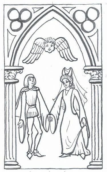
It's sometimes easier to draw in a medieval style than it is to do realistic art, because that didn't get reinvented till the Renaissance. Maybe you want to do a poster or flyer for a Renaissance faire or a medieval recreation event. Maybe you just want a Middle Ages party decoration for a themed birthday. It's not that hard if you look at a few historical sources and remember to copy -- just the way medieval artists did for centuries!
Step 1
If you want to be authentic for a medieval recreation event, decide what century and nationality you want your medieval drawing to be. Research it on the Internet and at the library. Different countries had their own styles of clothing and architecture, and style changed over centuries.
Video of the Day
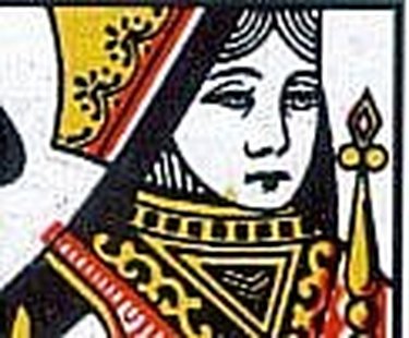
But if you just want a general medieval art style to your drawing, look no farther than the nearest deck of playing cards! The faces on the face cards are drawn very close to a medieval style -- the mouths and eyes are done like an ancient manuscript, the outline on the nose is traditional, the clothing is a little different because the artist wanted to put in as much detail as possible and the hair isn't just outlined, but the faces are a good example of medieval art. This is the style you'll be doing for your poster, flyer or other medieval drawing.
If you are doing a medieval drawing for a competition at a historical society, this is the stage at which to document your research too. Copy from multiple sources and cite them in your paperwork. The better researched a medieval artwork is, the more likely it won't lose points for insufficient documentation.
Step 2
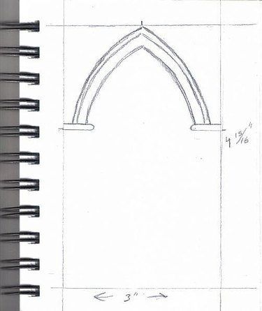
From the specific, we'll go to the general and create something that has a medieval feeling -- say, a lady and a gentleman standing in a traditional medieval arch. Churches often still have the Gothic style of architecture. You can look at local churches or photos online and still see the trefoil designs in pointed archways, which is what we're going to begin with -- the background, penciled in before putting in the people.
Medieval artists did not have graphite pencils. The oldest record of graphite pencils I've found is that graphite was discovered in Cumberland in the 1500s... which is very late, already in the Renaissance. What people used for sketching in the Middle Ages was either a silverpoint, a piece of soft pure silver wire in a wooden holder, or charcoal. While you can use a very thin piece of vine charcoal for authenticity, I wouldn't recommend it unless you're doing a demonstration in front of people.
It was more common in the Renaissance, but some medieval artists used the Golden Mean to decide the shape of their artwork, or elements of it. The proportion of it is 1 to 1.65, which may look awkward to us today since it's not one of the standard picture shapes we're used to. But if you want a subtle medieval feeling to it, you may want to use the Golden Mean to decide the shape of the picture. I used a calculator sketched it out on a 4" x 6" piece of paper and it comes to 3" x 4 15/16". A bit tall and skinny by modern standards, but it'll fill up soon enough with figures and ornamentation.
Find the center at the top. It's important to place the arch symmetrically, medieval artists were usually careful about symmetry in details. The whole building could be out of proportion and off to one side, it could be distorted and have no perspective, but an individual archway will always be nice and symmetrical. Mark a point at 3" up from the bottom, which creates a square drawing area for the characters to stand in, the whole upper portion is going to be archway details.
Sketch a line in about 1/2" wide on the 3" line, which will be the start of the pedestal of the columns on the sides of the arch. Round that off and go up about 1/8" to make the top of the column, we'll put fancy things under it later, but this shows where the columns will be. Now draw the archway, keeping the point at the center point of the whole drawing area. Do three lines, two of them farther apart and one close like a lip to the decorative arch.
Step 3
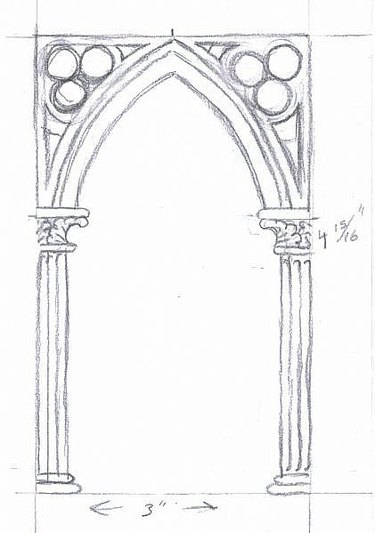
If you had trouble with the curves on the archway matching, try using a French curve. Slide it around until it lays right, then turn it over to do the opposite side. I'm used to doing freehand curves but you may find that easier.
Freehand three circles in the top corners that touch each other at the center. They should be roughly the same size. If your French curve has circle templates, you can use them to draw one. Don't worry about erasing and redrawing, that's what the eraser is for. Kneaded erasers are gentler on paper than regular erasers.
Draw the capitals of the archway. Do curly leaves on the capitals, the Corinthian style column was very popular in Gothic architecture and even more so on manuscript illuminations (pictures, illustrations to go with the text that were often gold-leafed and colorful). Add fluting on the columns and draw the column down to a simpler pedestal.
I am drawing with a dark, soft pencil so that you can see my examples in the scan. But you may prefer to use an HB (No. 2) pencil or even an F or H or harder pencil (F stands for Fine, H for Hard, and the higher the number, the lighter and more easily erased the line). If you press hard with a pencil you can groove the paper, so draw lightly for your guidelines. They will show up much better when you ink them.
Add little triangles with curving edges where they near the circles just to fill the area, and you've finished sketching the top of the archway. This is just a design similar to medieval designs, there are many examples to copy from and your best way to get accuracy is to actually copy or enlarge and trace a manuscript illumination. Remember, these designs are centuries old, so they are out of copyright. I've drawn a typical one using one symbol that cropped up in manuscript after manuscript, the trefoil of three circles that represents the Trinity.
Step 4
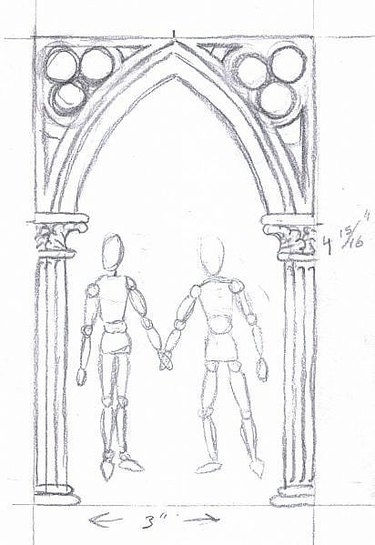
Now to sketch in the figures. This is where you can add a few details to make them represent people you know, like hair and eye color. Decide the characters you're going to have in your medieval drawing -- are they a king and queen, or two peasants, or a lady and a troubador? Using a wooden art manikin, sketch them in very lightly in the pose you want them to stand in.
Sketch lightly because you will erase this sketch. Make him a little taller than her unless you are doing portraits of people you know in medieval style and that doesn't fit.
While many medieval drawings had oversize heads and shortened bodies, the clothing folds always show the lines of the body underneath. This is a major element of medieval drawing style, so using the manikins will help you see where the lines of thighs and calves are. Also on the manikin, the feet are somewhat pointed and exactly the shape of medieval shoes. Be sure on both figures that one of the feet is turned to the side and one is pointing toward the viewer, for a nice view of the medieval pointed shoes.
If you don't have an art manikin, sketch the figures according to the proportions of a real person from a photo, but use that sort of loose lines to just show bulk in the body and separate knees, elbows, thighs, waist with a different circle. The way those manikins help is that they show how different parts of the body turn and where weight is resting in a standing figure.
Step 5
Stretch and flatten your kneaded eraser, then press on the position figures and peel off to lighten them. Do this until you can barely see the lines, so that your sketch will come through stronger. Sharpen your pencil.
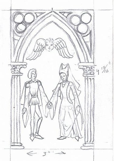
In this example, our characters will be a lady and a courtier. The lady will have a fancy 13th century hat with double cones and a veil dangling from them behind her, the courtier will have a short tunic, tights and a short cloak thrown back behind him. Both have fancy pointed shoes from the 13th century (1200's) when Gothic architecture and this type of drawing were very popular in manuscripts.
Start sketching in their costumes over the body shapes. Draw their faces simple in lines like the playing card Queen, and don't show the lady's hair under a headdress like the two-horned one. Hair was often hidden inside or under hats. I moved the gentleman's leg a little to make a better medieval pose, turning his leg slightly.
Nature abhors a vacuum, but not as much as medieval artists hated empty space in a drawing. So after sketching and detailing the figures' costumes and faces, I put a traditional design floating in the air above them filling the archway -- a cherub's face with two wings beside it. You could do an actual cherub there or doves or any sort of symbol that fit your drawing.
Common decorative elements I haven't used are roses, including a stylized five-petaled heraldic rose, unicorns, horses, swords, crosses, any symbol from heraldry is going to be drawn the way it was drawn in the middle ages. Copying heraldic designs is great to add more medieval detail and symbolism. Most books with heraldry also tell what the symbol meant in medieval times.
Step 6

Using an extra fine point pen, start inking these figures. You can go over it with a heavier line on some major outlines, but keep a fine line on facial features and small details. This is the stage where if I want to add fancy borders to costumes I will usually do it.
If you want an authentic look, try using a crowquill dip pen and a bottle of ink for the fine detailing and a dip pen with a normal drawing nib for the heavier lines. I use felt tips if it's just for a flyer or newsletter. Her hat looks a little odd, so I'll make it fancier and add a snood for her hair behind it, a net that pins it up under the hat and was often decorated with pearls or gold thread.
Inking is also the last stage where I can make corrections on something I didn't like in the pencil stage. Erase sections as you finish inking them and look for little details that got left out. Sometimes a penciled line can look like an ink line until it vanishes.
If you want to color your medieval drawing, use opaque watercolor or watercolor or colored felt tips. Be sure to do some highlights where the body shows under the clothing, say on the tops of thighs, and shadow with at least one shade darker of color. Faces are never pink, usually a very light shade of beige or maybe just left the color of the page. Very often colors will be brighter than we're used to for modern clothing. Ultramarine blue and bright red-orange are two of the most popular clothing colors. His tights might have one leg one color and the other the other color. Pink, green, red, blue, brown and yellow ochre are authentic colors to paint medieval clothes. Black was very rare since it needed to be redyed every time it was washed.
If you want to shade your drawing, use crosshatching or hatching.
Making some lines heavier than others was used in some medieval art. In other drawings, just one line width was used. By using a brush pen on the heaviest lines, I was able to simulate how ink applied with a brush was used sometimes on manuscripts. Most of the existing examples of medieval art are from books, because inside books the paintings and drawings were protected from light and wear. You can see the same styles in frescoes, tapestries, paintings and carvings too. The medieval style is so distinct that after copying a number of authentic drawings, you can easily make up your own!
Tip
Use a magnifier if you have trouble drawing fine details. Available at art stores and hobby shops, many of them have stands that leave both hands free for holding the art and drawing. Don't be afraid to combine elements from different medieval examples as long as they're from roughly the same period. Many medieval artists copied older examples, and you can see the same figure in more than one piece!
Warning
Don't use hot pink, lime green or other highlighter colors in coloring medieval art. Some colors including deep purple were not invented yet, and these will make your drawing look out of period.
Video of the Day