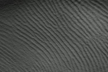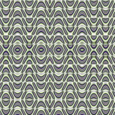
Design principles are universal concepts you can use when designing just about anything. Understanding design principles and using them effectively in your graphic designs will help you more-effectively achieve your projects' usability goals. Two design principles, rhythm and movement, can help you create designs that impart a sense of tempo and motion to your viewer.
Rhythm in Graphic Design
Video of the Day
Rhythm is the use of repeating elements in a visual design. Repeating design elements, such as shapes, lines or colors, draws the viewer's eye from one section of the work to another in a cadenced fashion. Rhythm can create a sense of order and a sense of movement. As an example of rhythm, a photographer can compose a photograph of a forest to show tree trunks as alternating thick vertical lines of light and dark colors. Successful designs usually vary the rhythm, or the design can become predictable and boring.
Video of the Day
Movement in Graphic Design

Movement is the use of design elements or principles, such as rhythm, in a way that suggests motion within an image. Movement can be created by implying action, such as a still image of a person dancing. Other ways to indicate movement include blurring the edges of an object. As an example, think of a horse running, with its mane and feet blurred. Some designs may show movement by showing a series of changes in position. Optical illusions are yet another example of movement that graphic design designs.
Difference Between Movement and Rhythm
Although both design principles can suggest motion, don't confuse them. Rhythm is specifically concerned with repeating design elements, such as patterns and colors, to pull the viewer's eye throughout an image or document. The designer may use rhythm as a means to convey movement, but rhythm won't always be used that way. Movement, on the other hand, is used to imply action. In creating a sense of movement, the designer can use rhythm, along with other graphic design principles and elements, to give the viewer a sense of motion within the image.
Use of Rhythm and Movement in Marketing Materials
Rhythm is used not only in images but also in design pieces, such as marketing literature. The literature's design can repeat the use of particular colors, typography and design elements to attract the viewer's attention and lead her through the piece in an orderly fashion. Movement can be used in print advertisements to impart a sense of action or speed to products, such as sports cars, that benefit by that association.