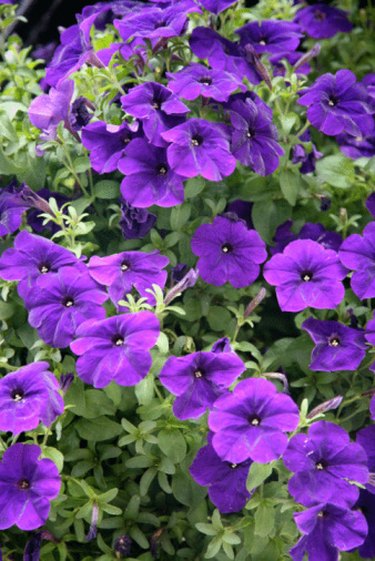
Perhaps you are mixing food coloring to create a bright purple shade to frost a cake or color popcorn for a themed event. Or maybe you are mixing dyes toward decorating Easter eggs. Perhaps you are even dyeing fabric to match your child's school colors. In any case, knowing which primary colors add up to secondary colors can prove useful. To achieve bright purple, red, blue and white are the hues you'll need.
Red
Video of the Day

Red is the primary color associated with strength, passion and power, according to Incredible Art Department. No wonder, then, that it should be a component of purple, with its connotations of royalty, nobility, majesty and ceremony. Red comes in many shades, from scarlet, vermilion and crimson to dogwood and burgundy. Red's varied notes are typically informed with undertones, such as yellow, blue and brown. Adding white to red creates pink.
Video of the Day
Blue

Blue would seem to occupy the opposite end of the color symbolism spectrum, associated as it is with peace, tranquility, calm and harmony, according to Incredible Art Department. It can also signify stability and conservatism, however, both qualities typified by ruling monarchs and recognized nobility. Blue informed with white takes on the pure, innocent qualities of the absolute. Adding black to blue makes it darker, resulting in such tones as midnight blue.
White

White is an absolute that can be added to any color or combination of colors to brighten or make paler. If you mix tones of red and blue and the resulting purple is not bright enough, it may be that the red or blue tone you used contains too much black. Adding the opposing absolute, white, should help you achieve the bright note of your choice. If adding white does not work, and the red you are using is more bright than dark, add more red to the mixture.